Bråttom. Exploring how movement can guide brand identity. Conceptual design for a logistics company focused on clarity and precision.

The idea
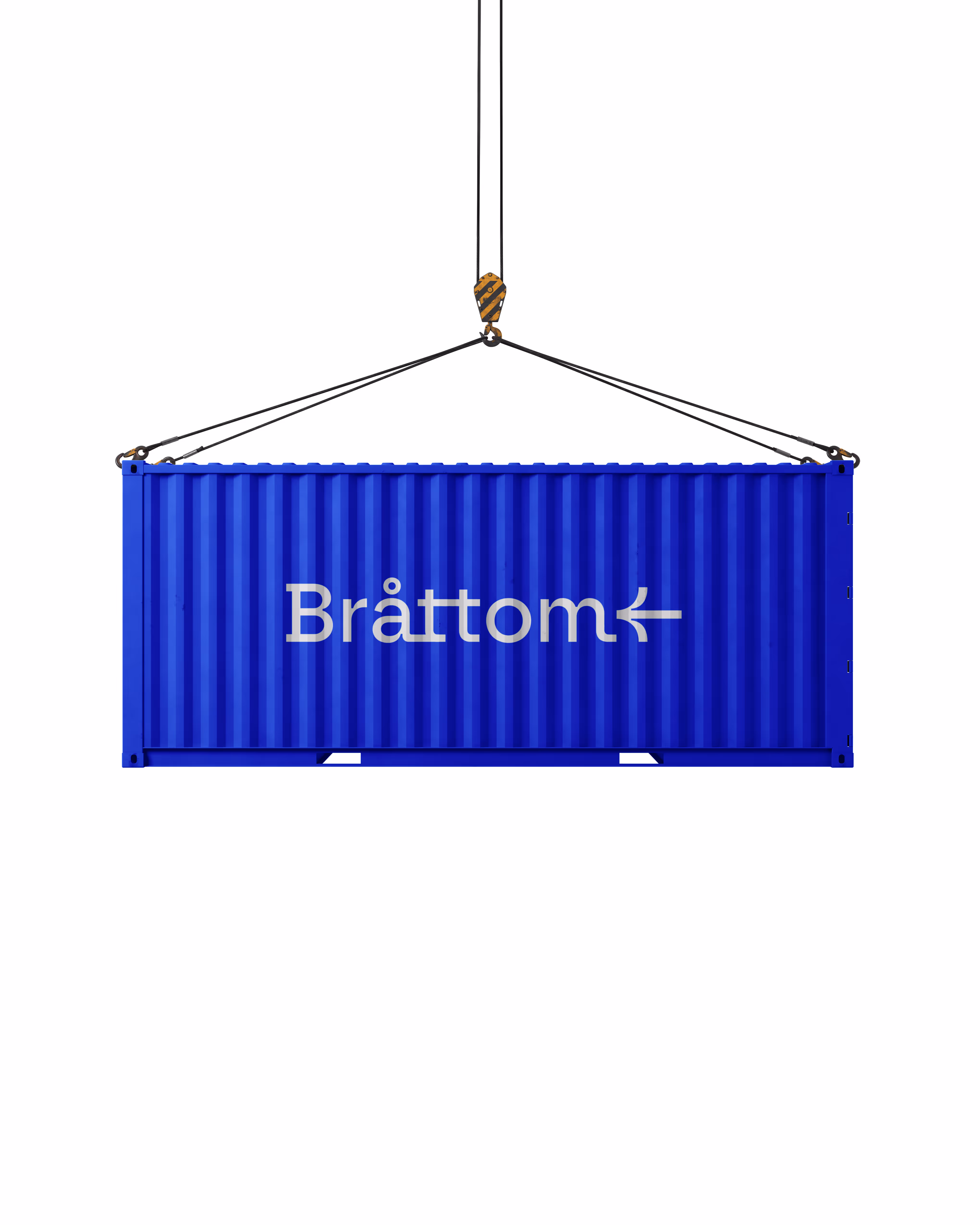
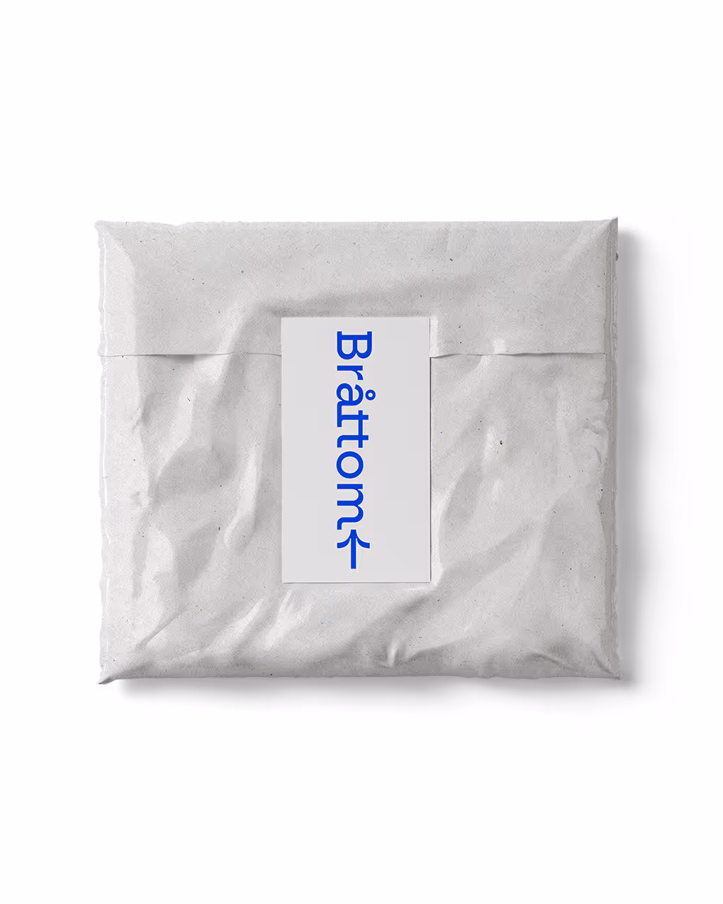
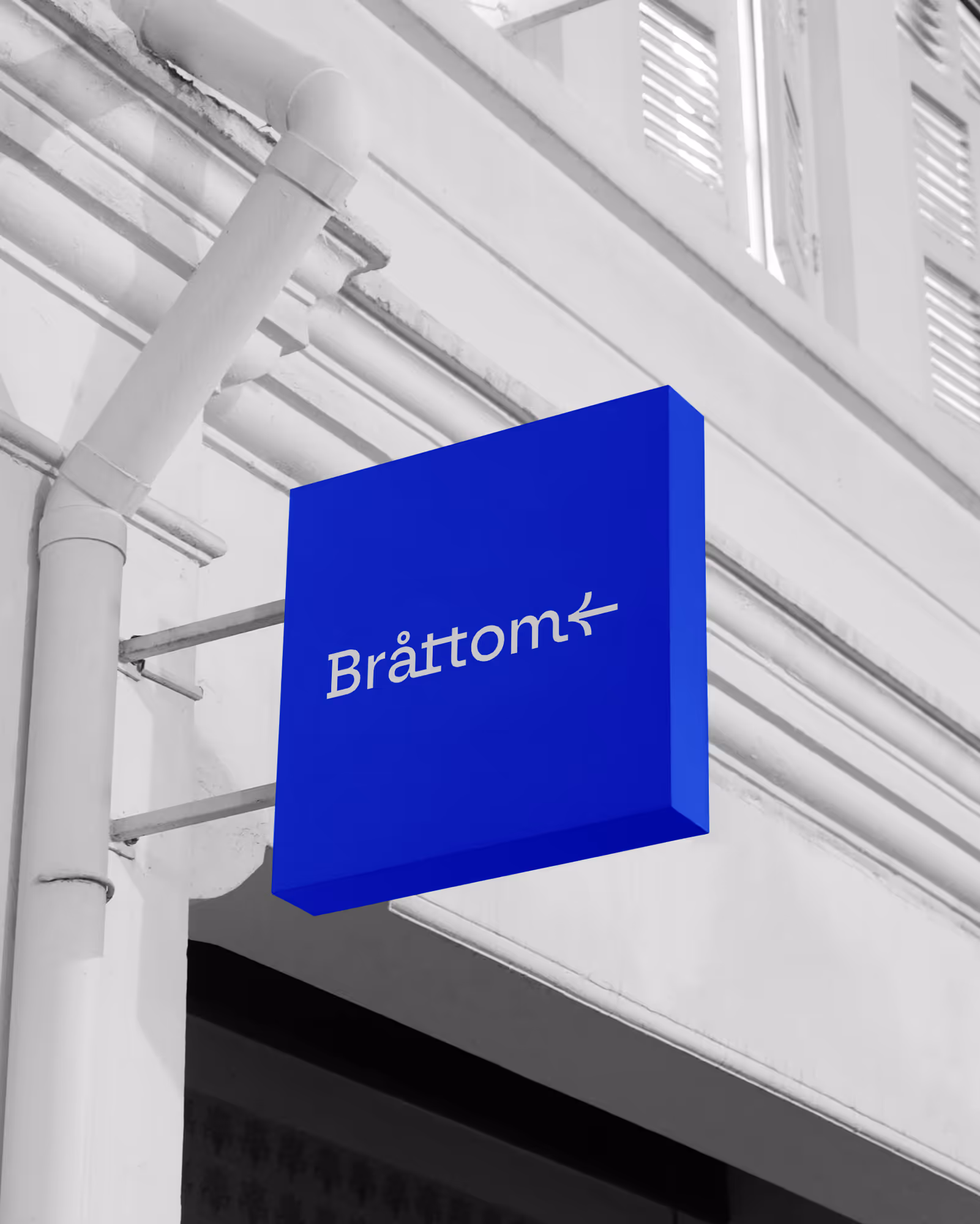
Bråttom is an imaginary logistics company.
Focusing on essential elements without unnecessary clutter. This approach highlights the commitment to efficiency and punctuality.
Unit
Bråttom
Type
Concept
Service
Brand Identity
Timeline
2023
Process
The design process focused on multiple iterative cycles to continuously improve the solution.
User feedback played a big role, with the majority of responses being positive, which helped validate design choices.
+40h
time spent designing
+12
design iterations
85%
of positive feedback received
Key features
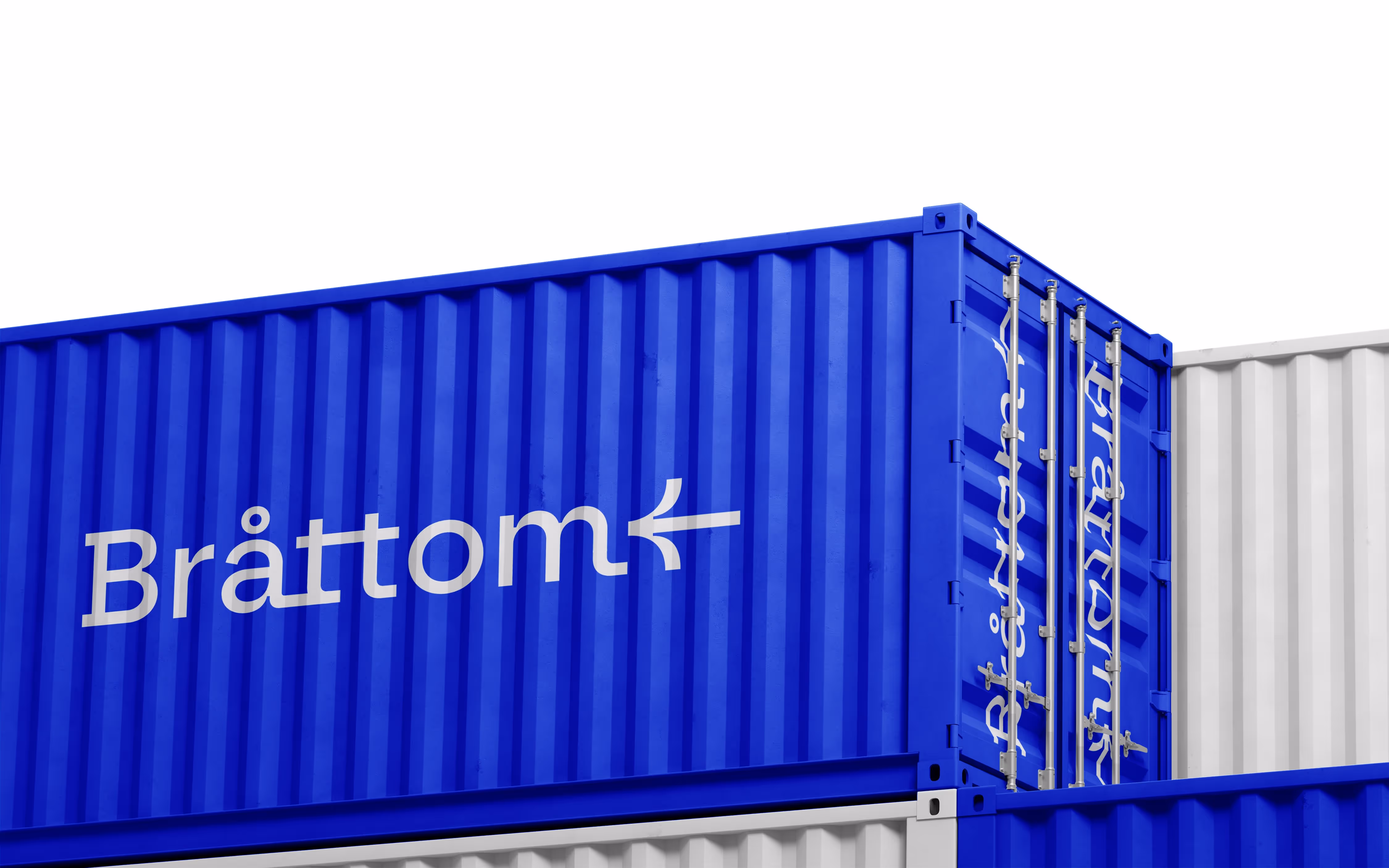
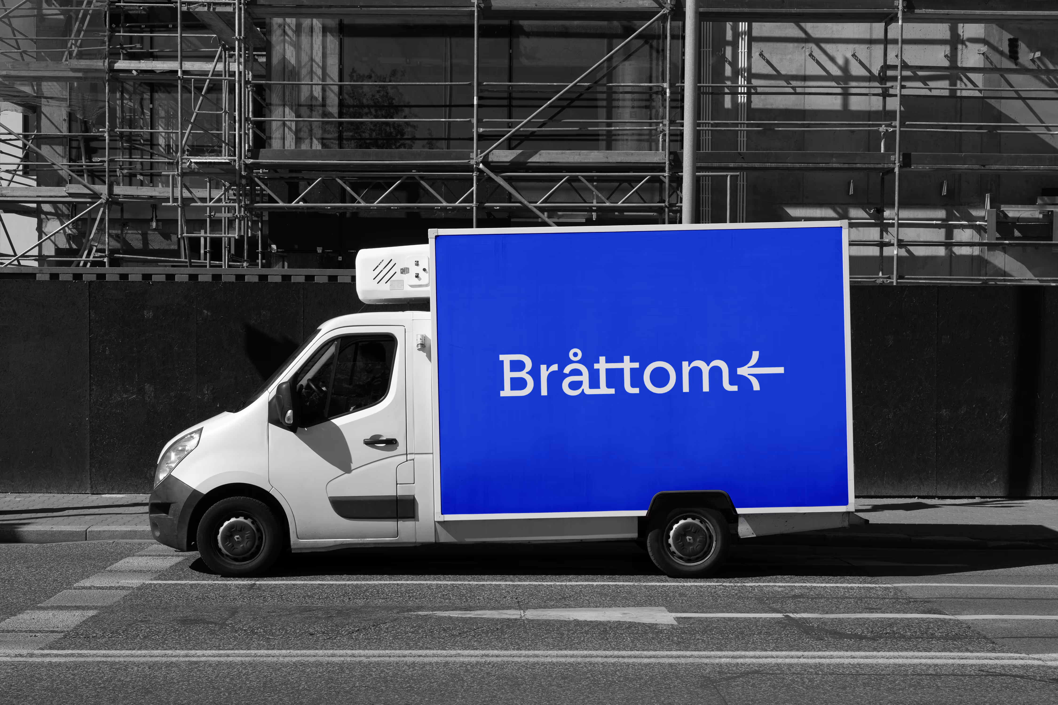
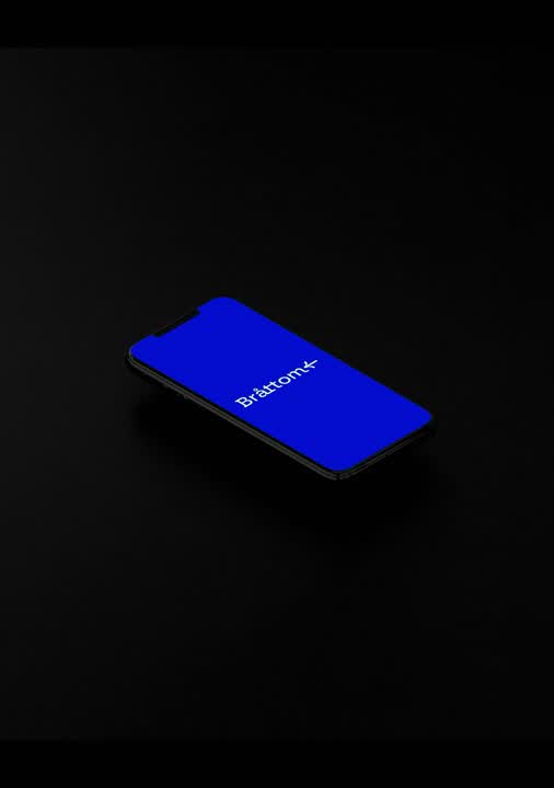
The use of a clean sans-serif font for the company name "Bråttom" ensures readability and a modern look.
The integration of an arrow within the typography emphasizes direction and movement. The symbol is a recurring element, reinforcing the idea of movement, speed, and direction.
Case study
Want to know the process in detail?
Request a case study!
Request a case study!
Make a request